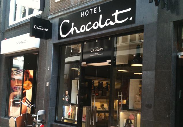
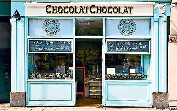
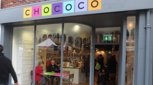
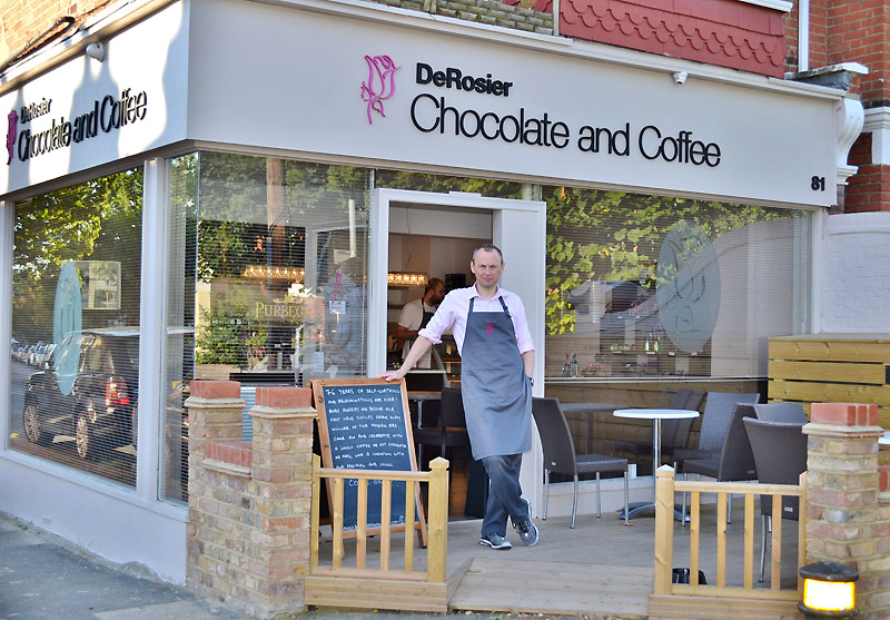
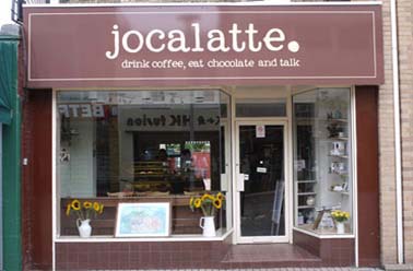
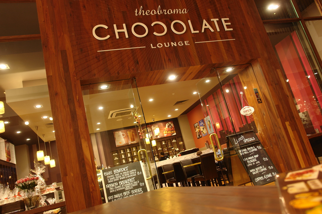
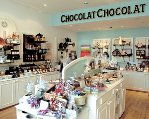
The top three images are all chocolate shops, the bottom three are integrated coffee and chocolate shops. My favorite designs are design 1, 3 and 6. I think these three are the most simplistic and look less "busy" on the shop front.
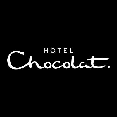
I really like the use of typography with Hotel Chocolat's design. The word "Chocolat" looks dragged and smooth, which is like melted chocolate.
I really like the use of typography with Hotel Chocolat's design. The word "Chocolat" looks dragged and smooth, which is like melted chocolate.
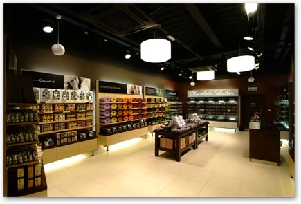
Again, the professional and smart feel goes through to Hotel Chocolat's interior design, and Chocolat Chocolat has the fun, cheerful feeling. They both work very effectively, but I think I am going to aim for the Hotel Chocolat design style for my company branding.