After feedback from family and friends, I have decided not to use the first idea's as they are too similar to Hotel Chocolat and may easily be confused. These are a few idea's I designed...
|
After feedback from family and friends, I have decided not to use the first idea's as they are too similar to Hotel Chocolat and may easily be confused. These are a few idea's I designed...
0 Comments
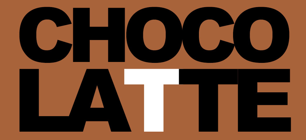
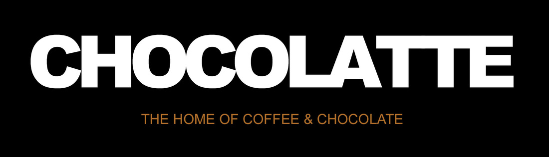
Now I have decided on a name for the company, I have started to come up with some logo ideas. I want the logo to be simple so that it stands out against my design work for packaging, and so that it is easily recognizable and easy to read for people passing by. I have used a simple black and white colour combination because I'm unsure of what colour's I will use for the actual packaging design, menu design etc. I may change this later on in the project. 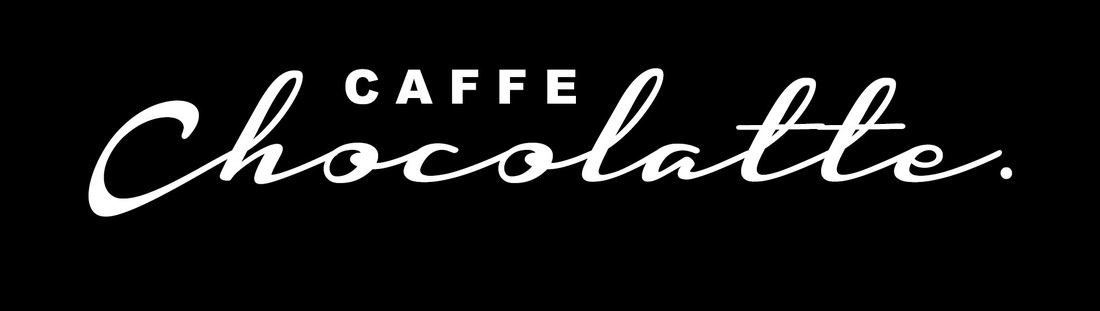 This design in particular was inspired by Hotel Chocolat. I really like it and think the placement is effective, the only thing I'm concerned about is that it is very similar to Hotel Chocolat's design and it may be confused with their brand, so I probably won't be using this as my final design. 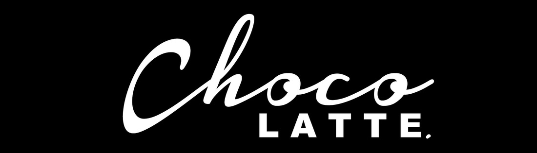 Again, this is inspired by Hotel Chocolat, but the placement of the text is very different. I think by placing the "Latte" below has made it unique looking compared to the above design. I used these fonts because I like the way that script fonts are dragged and almost soft and gentle, which reflects chocolate. I used Arial Black for "Latte" because I want people to see the word separately and know that the shop is integrated between coffee and chocolate. 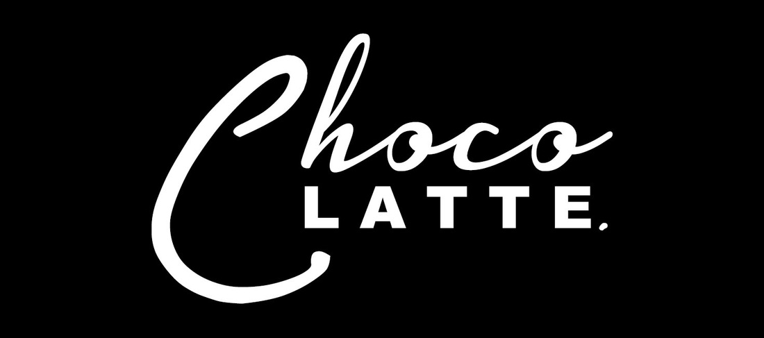 This is very similar to the design above but I have used a slightly different script font, and enlarged the "C" so that the words are aligned with each other.
|
 RSS Feed
