After looking at some examples of logo's, I've decided to look at imagery of the exterior and interior of coffee shops, to see how they use their brand identity in other ways, and how the overall feeling of the shops feel. It's really important that the brand follows the design throughout to keep their brand identity.
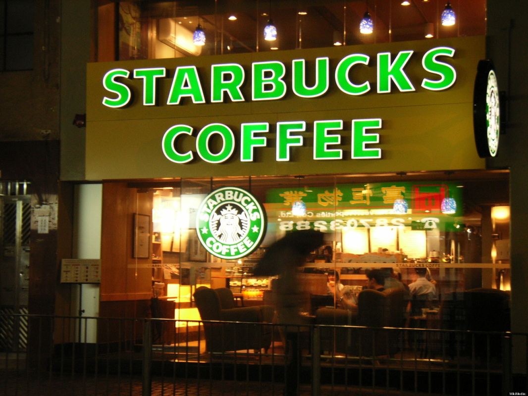
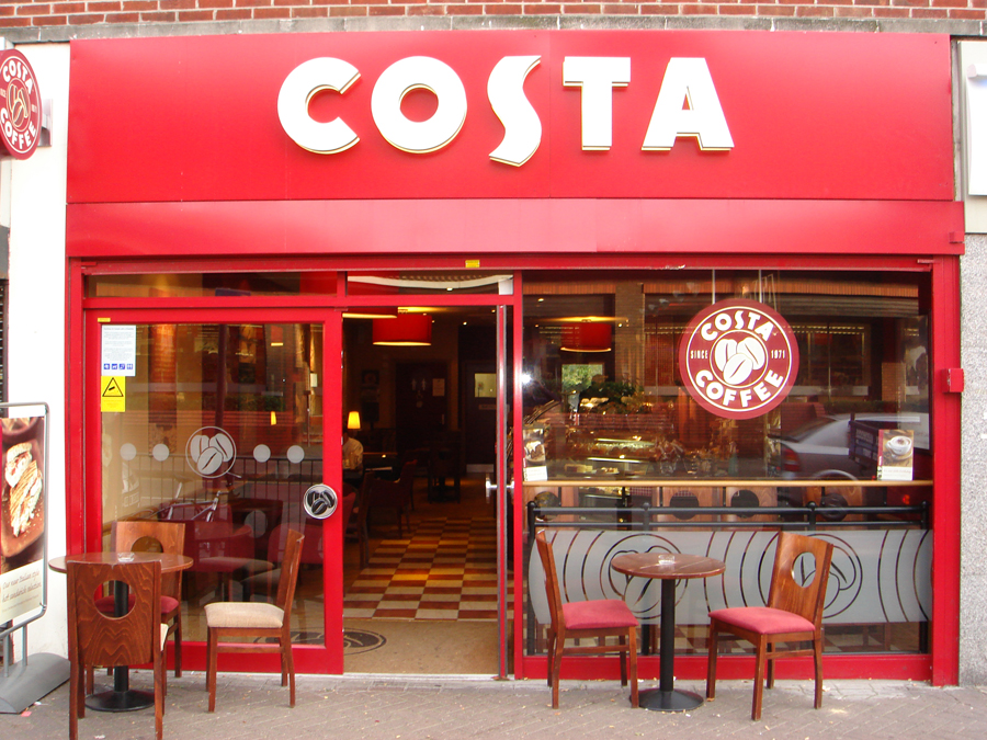
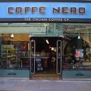
All three shops use the name of the brand as the shop front, this makes it obvious from a good distance what the shop is, rather than using the logo which would be harder to read. Both Starbucks and Costa have a hanging logo on their shopfront which is really effective and keeps with the brand identity. I think Starbucks is the most welcoming of these shops, simply because of the green colour and the imagery used in their logo.
I think the red of Costa coffee is quite overwhelming, also red in colour psychology is related to danger and panic - the colours remind me of a STOP road sign.
I think the red of Costa coffee is quite overwhelming, also red in colour psychology is related to danger and panic - the colours remind me of a STOP road sign.
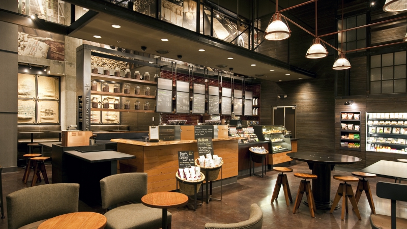
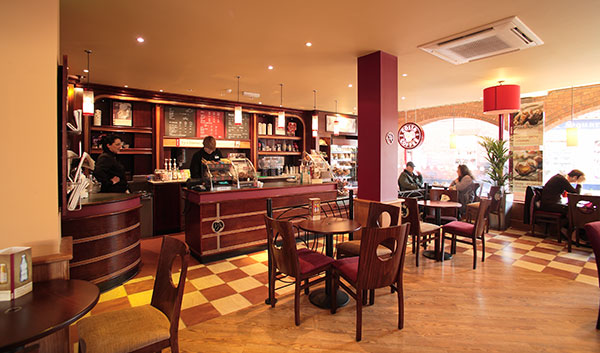
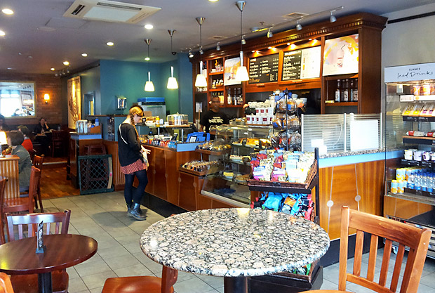
It's easy to recognize the interior of Costa and Nero, but not so much Starbucks. Starbucks has the most organic feel, which matches in with their green ethos. The red colour of Costa flows throughout the interior of the shop, and the same goes for Caffe Nero's blue.
